Thursday, 15 December 2011

Main Task: Publishing House Case Study


The Publishing Magazine I have chosen to focus on is Bauera Media. Bauera Media is a famous publishing house that’s published many magazines titles for different target audiences. The publish magazines such as Closer, Heat , Match, Mojo, Kerrang and many more. The audiences that they mainly look at for publishing are Middle Aged men and women. They have a variety of genres to suit different people. Some magazines are mainly for women or pregnant women or men who like sports or men who enjoy music. The reason why they have different target audiences is so they have many costumers. Being limited in there audiences wont make them as successful and known as they could achieve to be. Bauera Media have other media interests, not only to they publish magazines but they also publish radio shows, TV programmes, online sites and mobile broadcasting.


Bauer Media do not produce my genre of magazine nor do they have the same target audiences as me. My Magazine genre is Afrobeat and the target audience is teenagers. The reason why I would chose this publishing house to publish my magazine is because judging by the outcome and demand of the products that they do produce and they are outstanding. I would like to introduce a new genre to the company. I know there are great demands for my magazine therefore hopefully in due course I would have pave the way for more teenage aimed magazines to be published but Bauer Media

Thursday, 1 December 2011

Main Task: Moodboard


Main Task: Audience Research


I conducting a questionnaire consisting of 19 questions asking for my target audience’s opinion of my magazine and what might interest theme. One receiving all 20 questionnaires back from the participants I tallied up my data and made conclusion through the results.

In my magazine I will included the follow due to there demand:

Trendy Fashion Tips
The latest dance steps broken down into steps
A Black, Red, Yellow and Green colour scheme
Information on Celebrities and Artist
A Monthly Calendar that informs the audience on events within the month
Interviews on artist and up and coming Artists
A £2.00 price for the magazine
It will be distributed in local stores.

Tuesday, 29 November 2011

Main Task: Textual Analysis for DPS


Denotation: The Large image is of a guy performing and the other smaller images are also of, maybe the other members of the band, young males perfoming and workin gtogether as a group.
Connotation/NVC : The connations of the main image seems like a live picture. The photography took the picture at the moment. The Non-Verbal Communication of the subject seems passionate. He's head is tilted to the side holding the microphone and the stand represents that he is pausing for a break within the song since he isnt singing/speaking into the microphone. It also may show his emotions towards his song or career or maybe the speech he is making


Costume:All the characters in the images are dressed with a indie swag, denim jacket, black moiost probably skinny jeans and ruff back combed hairs or shaved mohicans. Their costumes illustrate the type of genre of music they may be professioned in, rock.


The Lighting/Mode: of the photos go with the colour scheme of the DPS. All the images are taken in black and white mode, which makes the photos in different shades of grey,black or white rather tha RBG colours.


The Colour Scheme: The color scheme is red and white to make the black and white images more effective. The red and white is striking and appealing to the eye.


Thursday, 24 November 2011

Main Task: Profile Audience


Hi, my name is Lydia Ejimbe, I’m a 16 year old and currently studying sociology, psychology, maths and economics in a sixth form college. In my free time I like doing normal teenage thins such as shopping, going out with my friends, partying and dancing, I've been dancing since I was young, I really enjoy it. I also love listening to music. My music sense is very eclectic, I listen to different genres of music, R'n'B, Rap, Hip-Hop, Pop and Afro beats. To me Afro beats are a bit of everything especially funky house and dancehall music. One of my favourite artists is, Trey Songz and Wiz Kid. Music plays a large part in my life, when I listen to music I’m in my own zone, it calms me down. A lot of people describe my as funny and a shopaholic. I love fashion, I would agree that I’m a shopaholic; I would say I’m very trendy. When I’m shopping it's like I’m treating myself. Plus I give great fashion advice.

Thursday, 3 November 2011

Main Task: Introduction

My name is Miriam Bello, I'm currently studying AS Media studies. In the Blog I will be exploring the elements on how to make a music magaize. To succeed in this task i will need to research previous music magazines, target audiences and the genre of music I will base my magazine on. I will create my magzine, front cover and double spread page, based on Afrobeats. I will be completing other main tasks such as a front cover textual analysis and a double spread textual analysis, in order to explore the codes and conventions within the magazine.

Main Task: Front Cover Textual Analysis


Denotation: The subject standing, wet.

Connation: The subject is wet and the background at which he is standing at is tiles this connotes that the reason why he is wet is because he’s been in the shower. This connotes sexiness.
Subjects costume: The subject is not wearing a top but has ‘Calvin Klein’ boxers on that are visible to the audience. The topless subject appeals to female viewers.

NVC: The subjects NVC is intense. His eyes are looking directly into the camera to enhance the tension and makes the magazine more direct towards the audince. His posture is very strong and piwerful, the subject has been shot from the waist upwards (mid-shot) so the audince can see his outfit (his briefs)
Logo: the logo of the magazine is to verify the brand of the magazine.

Masthead: The colour scheme of the magazine is red which is very eye cactchinh however due to the background the pale black tiling,it brings a more calmer approach to the front cover so people can make a judgment over the subject; wheather the colour scheme of the red type is to connote hot firery romance or whether the softly touch of the tiles connotes the subject as a relaxtion icon to pleasure their fantasy. The title of the magazine 'vibe' is behind the subject, atomactically the audience will know that the title is vibe because only the 'b' is slightly covered.


Font:The font is very simply so that the audience are not distracted by the fancy font type.


Also in the bottom left of the cover is another front page to the same magazine and in that magazine the subject is a famous rapper, the reason of having the same magazine but two different covers is so that one magazine appeals to someone even if the other doesn't. This particular front seems likely to appeal to females due to the dressing and position of the subject and this may not appeal to male audiences and there for in the other cover illustrates a famour hip hop rap start that relates to the genre of the music the magazine is based on.

Thursday, 20 October 2011

Preliminary Task:Front Cover FINAL


Pleliminary task: Front Cover & Contents Page Mock Ups


Thursday, 6 October 2011

Preliminary Task: Front Cover Conventions Diagram


Pleliminary task: Front Cover Textual Analysis


Denotation: The Magazine shows a man with books in his hands, law, business and society books.
Connotation: A student with his subject books in his hand which links to education. It represents a smart student judging by his subject books He looks happy which may suggest he’s happy about school.
Characters/Costume: The subject’s nationality seems to be maybe from the Caribbean judging by the sub-headings across the page ‘dancehall’, ‘jump up & wave’ Jamaica to be prises as the sub-headings mention places such as ‘Kingston’, ‘Negril’ . The young man that looks smart-casually dressed, this gives an impression that he’s serious about he’s education, books in his hands. He’s jewellery isn’t excessive.
NVC/Props: The young man is holding books, his stance seems positive. He’s facial expression seems very innocent, he smile isn’t complete but that’s not because he is unhappy but I think to give an innocent look to him and to education. . He’s wearing a cross chain which may mean he’s religious meaning he has good morals.
Lighting: The photo seems very professional. The lighting is on the subject, it’s almost like he has the spotlight. The background being black also makes him stand out more. There’s no setting because they want the audience to concentrate more about the subject
Masthead: The colour scheme of ‘college lifestyle’ is a yellowish and white so it can stand out from the dress code of the subject, black and white. Also the Title ‘college’ is behind the subject, so people assume that it is the word college, since it’s such a common word and it goes with the content of the front page. The distribution season is noted on the top, ‘summer 2009’ this shows the magazine is distributed every term. The yellowish colour scheme goes with the season ‘summer’ end of school theme. At the bottom of the front cover of the magazine the bar code is displayed with the price of the magazine, the price is shown its worth’s in American Dollars and Canadian Dollars

Thursday, 22 September 2011

Induction: Movie Poster Textual Analysis


Denotation: A man standing in the middle of a cave
Connotation: An archaeologist, who is in a cave, as part as he's adventure. The main thing in his adventure being the skull behind him


Anchorage: The font suggests it’s old. The title 'Indiana Jones' is written in a cartoony form, which suggests that the man is a character.


Costume: Indiana Jones is dressed in an old fashioned archaeologist uniform; the khaki uniform and hat suggest he's in a safari location.


Props: The whip is a signature weapon/item, and so is the gun. The gun suggests that this is an action film.
Setting: The setting is gloomy and it seems as if he's in cave which is not unusual for an archaeologist, however, the cave doesn’t seem like an ordinary cave, this creates suspense to the audience, there's a fiery skull behind him. This image maybe taken from the film itself as a 'sneak peak' for the audience it also reiterates the title; 'and the kingdom of crystal skulls.' Also one each side of the poster seems like a foreign hieroglyphics which suggest and gives the impression that 'Indiana Jones' is in a foreign country.


NVC: The NVC of the character is very confidence, he's standing feet arms width apart, and he’s shoulders are broad, he's fist are clenched. He looks like and alpha-male. He's facial impressions looks as if he was running, he's mouth is slightly open, he's face looks sweaty, this shows he's been doing some hard either running, fighting ECT, nevertheless, his stance still seems confident.


Lighting: The Posters lighting is produced by the fiery skull at the back of the man, this effect makes the setting seem like he's in a cave.


Font: The Font of the title 'Indiana Jones' seems cartoony, similar to the Flintstones title font. The font suggest the film will be family friendly. Whereas the sub-title's font is written with a matrix font, the types of font’s spies/special agents use as if Indian Jones' on a mission to the kingdom of skulls.


A few of his top buttons have been left undone maybe to either suggest that it’s either hot where he is located or to show the hard work also with his sleeves; they're rolled up which may indicate that he maybe doing hard work.

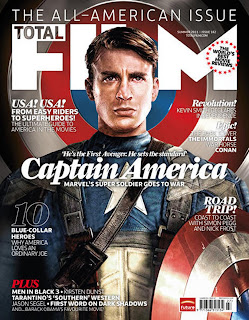
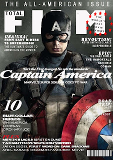
Induction:Re-Creation of a Movie Magazine Front Cover


I found this piece of work very exciting and fun since I've never used photoshop before, but after some basic intrusctions from Mr.Haylock and a few hours of exploring, I personally think I've done quiet a good job even though its not perfect. I did find things very hard but then I learnt how to do certain things like 'crop images', 'font channges', 'copy and pasting' which made it easier to use,I also manage to stay with the colour scheme and work around the background image using the majic wond tool etc. I used different shapes to mimic the original copy. To improve next time, I could download fronts from the internet so that it can be more of a match, I could alway work more on the space, and be more aware of the background image and how the size of front could make a huge differences.