Thursday, 22 September 2011
Induction: Movie Poster Textual Analysis
Anchorage: The font suggests it’s old. The title 'Indiana Jones' is written in a cartoony form, which suggests that the man is a character.
Costume: Indiana Jones is dressed in an old fashioned archaeologist uniform; the khaki uniform and hat suggest he's in a safari location.
Props: The whip is a signature weapon/item, and so is the gun. The gun suggests that this is an action film.
NVC: The NVC of the character is very confidence, he's standing feet arms width apart, and he’s shoulders are broad, he's fist are clenched. He looks like and alpha-male. He's facial impressions looks as if he was running, he's mouth is slightly open, he's face looks sweaty, this shows he's been doing some hard either running, fighting ECT, nevertheless, his stance still seems confident.
Lighting: The Posters lighting is produced by the fiery skull at the back of the man, this effect makes the setting seem like he's in a cave.
Font: The Font of the title 'Indiana Jones' seems cartoony, similar to the Flintstones title font. The font suggest the film will be family friendly. Whereas the sub-title's font is written with a matrix font, the types of font’s spies/special agents use as if Indian Jones' on a mission to the kingdom of skulls.
A few of his top buttons have been left undone maybe to either suggest that it’s either hot where he is located or to show the hard work also with his sleeves; they're rolled up which may indicate that he maybe doing hard work.
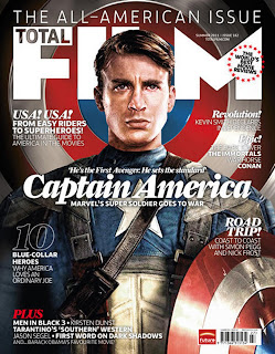
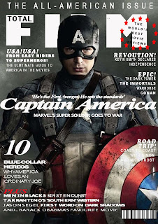
Induction:Re-Creation of a Movie Magazine Front Cover


I found this piece of work very exciting and fun since I've never used photoshop before, but after some basic intrusctions from Mr.Haylock and a few hours of exploring, I personally think I've done quiet a good job even though its not perfect. I did find things very hard but then I learnt how to do certain things like 'crop images', 'font channges', 'copy and pasting' which made it easier to use,I also manage to stay with the colour scheme and work around the background image using the majic wond tool etc. I used different shapes to mimic the original copy. To improve next time, I could download fronts from the internet so that it can be more of a match, I could alway work more on the space, and be more aware of the background image and how the size of front could make a huge differences.
Subscribe to:
Posts (Atom)
