Double Page Spread
Friday, 14 December 2012
RESIT: Main Task Evaluation 2
Front cover
These are the responses I've received from some peers on my front cover page. I fairly agree with some of the comments and criticism made towards my work, however, I don't agree with the comments about the position of where my barcode, price and website is because I purposely chose to put them in the top left under the masthead because I wanted to break a convention and also due to the position of my model I felt that the main cover line that supported the image should be in the lower right corner so that the text would not overlap the image. Apart from that I agree with everything that has been said and maybe he colour bend is too female orientated but it works in the see that it can draw men closer to the main image.
These are the responses I've received from some peers on my front cover page. I fairly agree with some of the comments and criticism made towards my work, however, I don't agree with the comments about the position of where my barcode, price and website is because I purposely chose to put them in the top left under the masthead because I wanted to break a convention and also due to the position of my model I felt that the main cover line that supported the image should be in the lower right corner so that the text would not overlap the image. Apart from that I agree with everything that has been said and maybe he colour bend is too female orientated but it works in the see that it can draw men closer to the main image.
RESIT: Main Task Evaluation 2
Content page
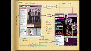
These are some of the feedback i received from other peers and target audience of my magazine. Judging form the feedback I can fairly agree with most statement. If I could change anything it would be how i presented the other images on my page. I may also want to change the background colour so it's more bright but apart from that i feel all conventions were followed correct in order for my product to deliver
These are some of the feedback i received from other peers and target audience of my magazine. Judging form the feedback I can fairly agree with most statement. If I could change anything it would be how i presented the other images on my page. I may also want to change the background colour so it's more bright but apart from that i feel all conventions were followed correct in order for my product to deliver
Subscribe to:
Posts (Atom)


